Book cover design
Duration
Four Weeks
Tools
Adobe Illustrator
Role
Visual & Graphic Design
How might I re-design a book cover for the book reader and purchaser through the visual language presentation and story, so that they will have a good first impression.
JUDGING A BOOK BY IT’S COVER


Redesign:
Three days to See — Helen Keller (2013)

"Three Days to See" by Helen Keller is a book that expresses the author's longing to have three days of sight to observe and appreciate the world around her. Blind and deaf from a young age, Keller imagines the things she would choose to see if granted just three days of vision. She outlines a detailed plan for each day, expressing a desire to see those closest to her, the natural world, and great works of art and literature. The essay is a poignant reflection on the importance of appreciating the senses we have, and it encourages readers to take time to enjoy the beauty and richness of the world around them. Keller’s words serve as a reminder of the value of sight and the other senses, which are often taken for granted.
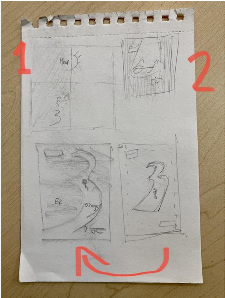
Process work & Sketches


Final Work Concept
(Illustrator)
Design: The design method I have used in my final book cover is the rule of third and one point perspective. It creates a sense of theme that the pathway and the figure are appearing in a realistic visual style.
Typeface: The typeface for the book cover title and text is Mr Eaves from Adobe font, since this typeface has a sense of modern style to use for the book cover present.The font of Mr Eaves is a Transitional serif typeface designed by Zuzana Licko and published in 1996 through Emigre. The features of this font is with accompanying italics, small caps and alternate characters.


Final Work Concept 1 (Illustrator)
Color and why:The colors in my final work that I choose for the visual present is Black and Orange, and the white text. The reason that I choose black and orange is because these two colors have strong contrast but meanwhile they adapt to each other visually at the same time. In general speaking, black is the only color we can see when we close our eyes. Thus, black is the ideal color used to represent a person that is blind. Although the color of orange can represent many things, one of the examples is orange is the suitable color to represent the emotion of positive. Meanwhile, orange is the closest color to the Sun, this can be recognized as the opposite side of blindness.

Final Work Concept 2 (Illustrator)
Font: The font that I have inspiration for the "Three" is the font Wigwag from Adobe font, I chose this font because it is one of the closest fonts to my concept.
Meaning and Tropes: The lady that is walking on the bright orange "three" pathway is the author Hellen herself. Although she has the issue for her visual, it does not stop her travel on her own fame of walk.
